Playing with Tuna
Last night I was playing around with Tuna as I said earlier this week. I really like the typeface and I used the option of MyFonts to temporary use it locally on my machine to test it. I quickly changed the css to use Tuna. It would certainly need some fine tuning and playing with weights here and there, as well as some more line-height for the text bodies with more text, like in the blog posts.
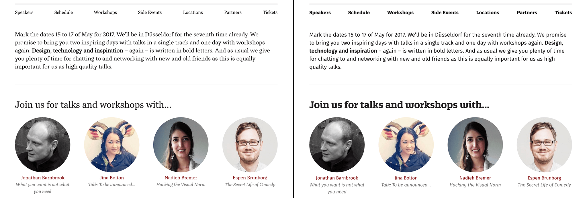
A few examples as screenshots side to side. On the left side you see Tuna in use and on the right side the actual Quatro Slab with Fira Sans. Again, these are only quick sketches and also screenshots are all shrunk to fit my blog width. But I wanted to get a first impression.
Click on the images for a large screenshot made on a retina display.

I really like the thin italic version of Tuna. It look more elegant than the italic Fira Sans.
I am not sure about the main navigation and might play around with different weights here next. I think it might use the forced bold variation of regular in this screenshot anyways, which is wrong of course Also on the call to action buttons, I think a bolder variation would be better of course.
But as said, I wanted to get a quick, first impression.

I was not sure about the main headline, but I have chosen the light italic version for h1. It looks completely different to the very bold Quatro Slab but somehow I like it.
I also like the speaker grid variations of the text. The read names in regular and the topic in italic.
Again I am not sure about the event navigation as it is right now. Needs some tinkering to find out what looks best.

I like the look and feel of the job list – which also looks similar to the blog list. The overall feeling is lighter without being actually much lighter than the Fira Sans version. Except form the main headline, where I have chosen a thin and light version as said.

I also like how h2, the green one, looks. Maybe I go with the bold version here, just to have some more contrast and a bit more “fun” for the eye.
In general I quite like the look and feel with Tuna. I think a bit more line-height for the text is needed and some tinkering with weights for the headlines and buttons as well as details like the teaser text in the masthead. I really like to hear from you: What do you think?
https://floodfonts.com/tuna/