Don’t get me wrong: I also use Facebook. For many reasons it is quite nice and useful for me. But the reason why Gruber says this, and why I say “Yes, that’s right” are things like this:
Treat Facebook as the private walled garden that it is. If you want something to be publicly accessible, post it to a real blog on any platform that embraces the real web, the open one.
or
The Internet Archive is our only good defense against broken links. Blocking them from indexing Facebook content is a huge “fuck you” to anyone who cares about the longevity of the stuff they link to.
In May I ran my Düsseldorf edition of beyond tellerrand. I was happy to find out, that Typo Berlin had a gap of a week after my event. So I could attend. Next year this is problematic again, as Typo is taking place in the same week as beyond tellerrand again. beyond tellerrand takes place Monday 14th to Wednesday 16th and Typo from 17th to 19th. When speaking to Jürgen Siebert last week he said “Oh, but I announced this really a long time ago already”. And so did I with my dates. It is just, that there is no place, where you can look at and where organisers announce their event dates early enough and or at all. The question is now, how can we avoid overlapping events? I mean, Typo and btconf don’t even overlap in 2018 and from an organisers standpoint, we can even maybe share travel cost for speakers who speak at both events. But often events do overlap and for me, going to many events, this is a pity as often I have to decide for the one or other or the density of events is so big, that I would get into serious trouble with my family, if I attend all of them.
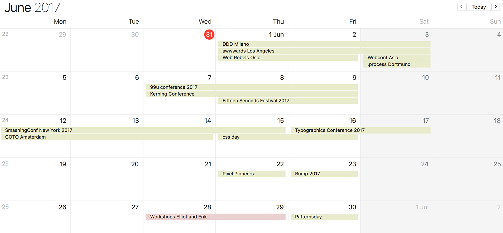
Some month are worse than others and if you see events announcing their end, you see two new events announcing they are coming. Take June this year for example. The green bars show only the events I am interested in and I got notice of. I am sure there are even more. First of all you see a clear trend to run events towards the weekend on Thursday and/or Friday, if not event at the weekend. This, for me at least, having a family, is a problem. Usually weekends belong the family and my kids. More and more events, though, are held on a Saturday and if on the Friday, you might want to leave on the Saturday, not to miss the real juice of most events: the time in the evening with conversations and networking with attendees. But the sheer amount of events in general in month like June or September, to mention another month like this, is crazy:
DDD Milano – the digital design days in Milano. Met the organiser earlier this year in London and his plans for it sounded great.
awwwards Los Angeles – a formerly web/front-end oriented event, now naming themselves digital thinkers conf.
Web Rebels in Oslo – a web an d js conference. Never been there, heard so many good things and always wanted to go.
WebConf Asia in Hong Kong – a practical event for the web community. Charis Rooda is running her first, own event. Would be e great chance to meet many friends, plus I never been to Hong Kong before.
.process in Dortmund – a pretty new event, been held for the second time. They invited me to come and speak, which I’d love to have done.
So the events above take place around the same weekend and I would love to have done all of them. Sadly – in terms of attending events – it is Pfingsten (I think it is Whitsun in English). We always are in a little house over this long weekend with two other families and enjoy the time in a forest. That date is set in stone usually from Friday to Monday.
Right before the next weekend we have got …
99U Conference in New York – I have never attended this event, but always wanted to got, as I heard good things. And I like New York.
Fifteen Seconds Festival in Graz – an event more on the business side of things, but it is said to be very personal. Graz is a lovely town, I like to visit as well and I have good memories of from working with video2brain in the past.
So, again, three events taking place at the exact same time. Not an issue for them actually, as topics are different and they are so far apart from each other, that they won’t have a problem concerning attendees or event speakers. I actually would be able to go to one of them, but it is always a fine balance not to make my family sad. On the following Sunday to these events, I’ll leave for New York as part of the Smashing team:
SmashingConf New York – since I started SmashingConf together with Vitaly Friedman and am part of board of directors of the Smashing Media AG, I like to join in for the SmashingConf’s around the world. I take photos, make notes, what could be improved and what went well and chat with Vitaly and Markus about this and enjoy my time being at the event a lot.
GOTO Amsterdam – GOTO is software development conference. I never attended, but have spotted some really interesting people in the line-up. Have to miss it again.
CSS Day in Amsterdam – PPK, Krijn, Martijn and formerly Stephen are organising this event for a couple of years now. I attended three years ago and try to come back since then. Always overlapping with something else, sadly. But one day …
Typographics in New York – a design festival for people who use type, is what they call it themselves. I always happen to be in New York for the last couple of years, when it took place and bump into several people I know, attended events around it, but never actually attended. This year I planned this, but am already more or less gone again. Next time then …
I use my time around an event to meet people I know in this particular city and stay in touch. Sometimes, like last year with awwwards Conference in NYC, it works out, that I am able to attend other events while being in town. But usually, again, I don’t want to over-do the travelling, having an eye on my family.
The week after New York, I’d be able to attend events usually, but having a look at the calendar shows me, that in the last week, I am organising two workshops in Berlin (one with Elliot Jay Stocks, one with Erik Spiekermann) and then jump over to Brighton to take photos at Jeremy’s event, so I better be careful with this week, as one day otherwise my keys don’t fit the door at our house anymore. The events I am likely to miss are:
Pixel Pioneers in Bristol – Oliver Lindberg left net Magazine and is running his own event now, after being responsible for Generate Conf by net Magazine. This one is his first edition and I so would love to be part of it and take photos, but it looks like I won’t be able to, sadly (not only time, but also budget issue).
Bump Festival in Kortrijk – friends of mine used to organise an event called Multimania in Belgium. I have been there quite often and last year they changed the format an re-branded it and I already missed out. Unfortunately it seems, I have to miss out again.
The two events above would work speaking about time. Kortrijk is even easy to go to by car from my place for one day, which is different for Bristol, where flight and hotel add to the purse. But I have to get some work done for my own events and, as said earlier, have to consider my time with the family as well. And then the week after, I am on the road again.
Advanced Typography for Web and Print – Elliot Jay Stocks asked me to organise this full-day workshop with him and we have chosen Berlin as city to run it.
Letterpress workshop with Erik Spiekermann – me being me, I thought just one workshop would be too easy and not enough work. So I thought to add a lovely letterpress workshop at p98a, where I always also organise a workshop during beyond tellerrand in November. This time it looks as even Erik would be around.
Patterns Day in Brighton – after Jeremy ran Responsive Day Out for three years, which I reallyliked, he is back with a new event called Patterns Day in Brighton. Right now it seems, I am going to be there to take photos, but have to check a few things to make sure it works, as I was planning to bring my kids with me. Fingers crossed.
So, why am I writing these lines, you might wonder. First of all to give you an overview of what is happening in June on the event landscape. Then, to complain that I can’t split into multiple Marcs to be at several events at once. But also to complain, that I have the opportunity to do what I do and attend events as part of my job. I know how fortunate this situation is and how lucky I am and therefore I would never really complain about what I have written above. I burn for attending events, speak to all these different people with all their many opinions, ideas and stories. That is why I am always a bit sad to miss one. But maybe there is an event in this list, which you like to attend, as it is close to you or matches a topic, that you are interested in or want to dive into. Then please do and let mw know how it was.
Take care.
Did I miss an event, I should have heard of? I am sure there are many more interesting events. Please don’t hesitate to let me know (information how, in the footer of this site). Thanks.
I spent the last two days in Berlin at Typo Berlin. I had wonderful conversations with many lovely people so far and met interesting people I did not know before. Enjoying myself and the weather a lot.
I have written about it a while ago, but maybe it helps, when I do this again. I am sitting at the workshops of beyond tellerrand Düsseldorf 2017 and read tweets and feedback for the last couple of hours. It is so much stuff that the attendees have written and I had a lovely time during the last two days. It is wonderful to see that so many people had a lot of fun and a good time. Now the sad feelings, that all this is over again, are slowly creeping up. I feel empty, drained and tired. But at the same time I fell happy, proud and warm. I am happy and humbled to have met so many fantastic people during the last 7 years. So many people who joined me on a journey beyond the tellerrand. Thank you all for being to kind and making the event what it is.
When using wikipedia, I really wish Frank Rausch would also do a web version of his app V for Wikipedia. I love it and use it a lot. When using the Wikipedia website, I am kind of frustrated … Frank? ;)
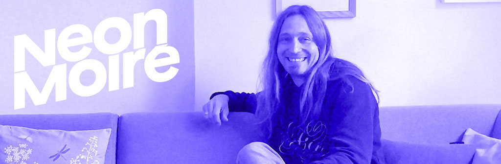
Thomas Dahm from Neon Moiré visited me and we had a nice conversation about all things related to events. We chatted about the beginning, a few specific matters like swag and partnerships or how I try to curate beyond tellerrand.
It was nice having Thomas around. His site, Neon Moiré, is an independent guide for design events and next to interviews, like the one with me, they publish event reviews and a calendar with interesting events.
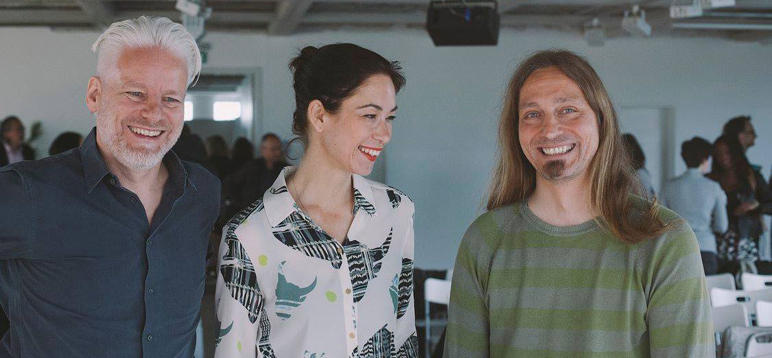
A set of photos from CreativeMornings in Düsseldorf, April 28, 2017. Photos by Celine Al-Mosawi.
Last Friday, Lisa and Rainer invited to speak at the CreativeMornings in Düsseldorf. Theme for April was “beyond” and while we all had been at an event of Wacom in Düsseldorf, they asked me, if I’d like to come and speak. Next to shitting my pants and actually not having the time, because I was/am already knee deep in the preparations for beyond tellerrand in Düsseldorf, I very much enjoyed it and had a lovely morning and wonderful feedback and conversations after my talk, which made the whole experience a really good one.
If you use CSS in your daily work, your primary goal is probably focused around making things ‘look right’. How this is achieved is often far less important than the end result. This means we care less about how CSS works than the correct syntax and visual results.
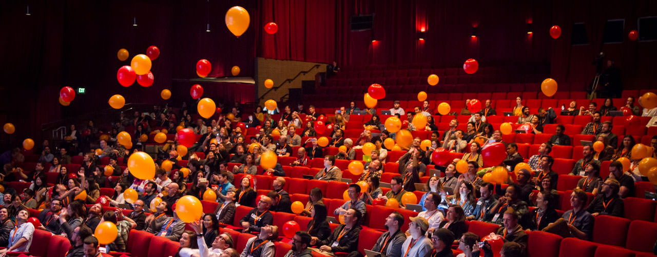
While sitting at the workshop venue here in San Francisco, I finished uploading my photos of the last four days. Covering both workshop days of the second edition of Smashing Conference in San Francisco as well as the two conference days. I hope you’ll like them.